
While we all have our own favourite colour pallets, some people find it harder than others to pick a scheme that goes well together. ALL colours can go together, but you need to choose the right TONE of that colour for it to work, or create a blend of tones! For instance, orange and mint green often don't go well together, though they are two of my favourite colours:


But vary the orange tones, and add a teal (opposite to orange) and light green (a different tone of green but in the same colour family to mint green), and you have a vibrant, but more unified combination.

Then there are the colour schemes that remind people of brands or specific objects.... red and gold? McDonalds. Purple and white? Cadbury. Orange and Brown? Jaffas.
Okay well now I'm just listing things I like to eat.

(side note: this is super cool! A crochet knight's helmet? Who knew this existed!? But it really looks like the knight has come straight from the golden arches...)
But, again, if you vary the tones, your work looks inspired by nature, not a fast-food joint. Add mustard, light/dark yellows, burgundy, and rust.

Then there are the colours that most people loathe, that happen to work particularly well with some pallets! 'Nappy Gold'? You can merge that with some greens and create a beautiful nature-themed pallet. (If you have been around a newborn baby long enough you know what I mean by 'nappy gold')
So, choosing colours. What are my tips?
***
One: consider choosing a stimulus.
For my crochet stool covers:

I used an artwork from our home as a basis.

But for my Sunburst Blanket

I just chose my favourite colour combinations and went from there!
Your stimulus could be as simple as 'warm' or 'cool' pallet, like these
Warm:  Cool:
Cool: 
Cool:
***
Two: Use the Colour Wheel!
For those who aren't sure about basic colour schemes, the colour wheel is always fabulously helpful if you know how to use it! You have your primary colours - Red, Yellow, and Blue - and your Secondary Colours - Green, Purple and Orange. Tertiary colours are when you add a primary colour to a secondary colour, resulting in colours like teal (green + blue), shades of brown (varying amounts of each one primary colour & opposite secondary colour - eg: yellow + purple, blue & orange, red & green).
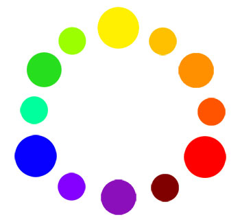
You could use an Analogous colour scheme - which means colours next to each other on the wheel, like this (the next 3 yarn colour wheel images taken from Fresh Stitches - visit them here! They also discuss choosing colours for yarn beautifully :))

Example of Analogous Colours: Green, Blue, Purple

Complementary Colour schemes mean colour choices that are opposite each other on the colour wheel, like this!

An example of Complementary colour scheme: Indigo and Gold (colour wheel opposites)

If you want a few different colours, try for Split Complementary, which is a little less 'in your face' than regular complementary colours.

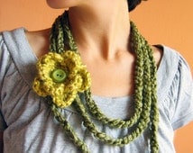
Example of Split Complementary Colours: This gorgeous Etsy find:

***
3. Use samples of your own yarn to work out a colour pallet!
I love using a sampler (or just laying out all my yarn and switching it around to choose great colour combinations!) As I'm a pretty visual/kinaesthetic person!

I love what Lucy from Attic 24 has done with these pegs!

***
4. Vary your pallet.
Rather than simply using two colours - Purple and Pink - use several varying shades and tones of those colours from red-pink, to lilac, to violet, to indigo. Include one or two pastel shades, but not too many if you want a really rich, vibrant effect.

Or if you choose several colours, here are some beautiful, bright, colour pallets to choose from! You can find so many inspirational colour pallets on platforms like Pinterest (where I get most of my inspiration!)


***
5. LOVE your colours!
But my main tip is just choose colours you LOVE to look at together! If you love it, you will use it. Or if it's for someone else, they will know how much love (and time!!) you put into it!
Hope your colour journey goes brightly!
Love and rainbows,
Rhonie xx
No comments:
Post a Comment